Civilization VII's Deluxe Edition debuted just yesterday, and online discussions are already buzzing about its user interface (UI) and other shortcomings. But is the criticism justified? Let's delve into the game's UI elements and assess whether the internet's assessment is accurate.
← Return to Sid Meier's Civilization VII main article
Is Civ 7's UI as Bad as They Say?
Early adopters of Civilization VII's Deluxe and Founder's Editions have had a day to experience the game, and the UI is already facing significant criticism, alongside complaints about missing quality-of-life features. While it's tempting to join the chorus of disapproval, a balanced assessment is needed. Let's dissect the UI piece by piece, evaluating whether it meets the standards of a good, or at least functional, 4X interface.
What Makes a Good 4X UI?
Defining an objectively "good" 4X UI is challenging. The ideal design varies depending on the game's style, goals, and context. However, common elements consistently appear in well-regarded 4X UIs. Let's use these established principles to analyze Civ VII's UI.
With that in mind, let's evaluate Civ VII's UI against key elements generally considered crucial for effective 4X game interfaces.
Clear Information Hierarchy
A clear information hierarchy prioritizes accessibility and relevance. Frequently used resources and mechanics should be readily available, while less crucial features can be accessed with minimal clicks. A good UI doesn't display everything simultaneously; it organizes information logically.
Against the Storm provides a strong example. Each building's right-click menu features tabs categorizing information by frequency of use. The default tab highlights common actions, while less frequent functions are neatly organized into separate tabs.
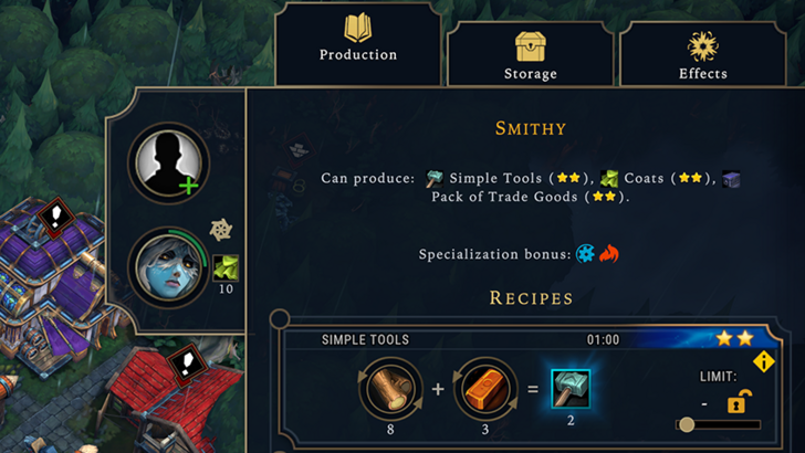
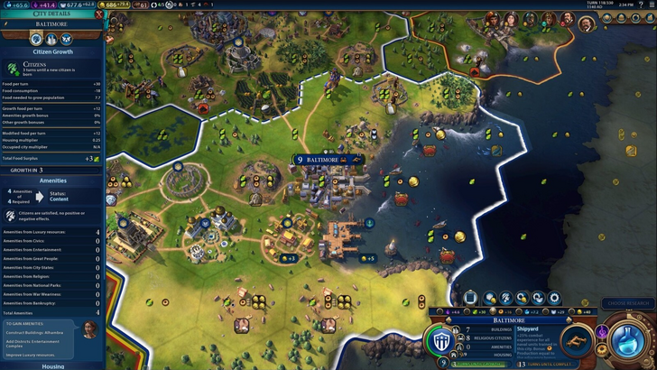
Let's examine Civilization VII's resource summary UI. The summary effectively displays resource allocation across the empire, separating income, yields, and expenses via dropdown menus. The table format facilitates easy tracking, with detailed breakdowns available. The menu's collapsible design is efficient.
However, a lack of granular detail is a drawback. While overall resource generation from Rural Districts is shown, the specific district or hex isn't identified. Expense breakdowns are also limited, omitting several cost factors.
In conclusion, Civ VII's resource UI is functional but could benefit from increased specificity. It performs its core function but lacks the depth of some competitors.
Effective and Efficient Visual Indicators
Effective visual indicators use icons and graphics to convey information quickly, minimizing reliance on text. Well-designed UIs utilize symbols, colors, and overlays to communicate data efficiently.
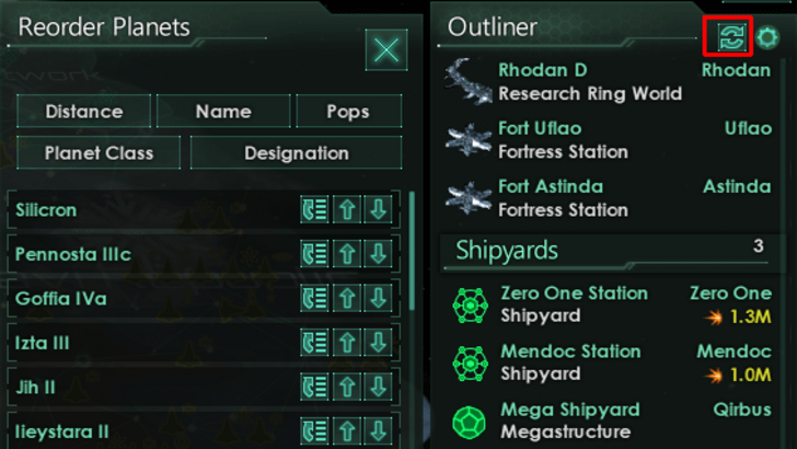
Stellaris, despite its cluttered UI, demonstrates effective visual indicators in its Outliner. At a glance, players understand the status of survey ships. Icons near planet names indicate colony needs, reducing extra clicks.
Civ VII utilizes iconography and numerical data for resources, but includes effective visual indicators. The tile yield overlay, settlement overlay, and settlement expansion screen are notable examples.
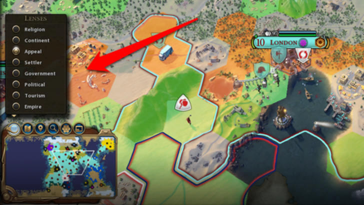
The main criticism centers on missing lenses present in Civ VI, corresponding to features unique to that game (appeal, tourism, loyalty). The lack of customizable map pins is also frequently mentioned. While not terrible, Civ VII's visual indicators have room for improvement.
Searching, Filtering, and Sorting Options
In complex 4X games, search, filtering, and sorting options are essential for managing information overload. Search bars, visual filters, and sort-by buttons streamline navigation.
Civ VI's search function excels, allowing players to locate resources, units, and tile features easily. Its Civilopedia links entries to in-game instances, facilitating seamless navigation.
Civ VII's absence of a comparable search function is a significant drawback, impacting usability. This omission is a major criticism, especially considering the game's scale. Adding this functionality, along with enhanced Civilopedia integration, is crucial.
Design and Visual Consistency
The UI's aesthetic and cohesiveness significantly impact the player experience. Even with strong gameplay, an unappealing UI detracts from the overall enjoyment.
Civ VI's vibrant, cartographical style seamlessly integrates with the game's aesthetic. Its UI complements all aspects of the game, reinforcing its identity.
Civ VII adopts a minimalist, sleek design, prioritizing refinement over vibrancy. The restrained color palette aligns with the game's aesthetic, but lacks the immediate visual appeal of Civ VI. This subdued approach has resulted in mixed reactions, highlighting the subjective nature of visual design.
So What’s the Verdict?
Not the Best, but Undeserving of Extreme Criticism
Civ VII's UI, while not optimal, doesn't deserve the overwhelmingly negative reception. While key features are missing (particularly the search function), these flaws aren't game-breaking. Compared to other issues, the UI's shortcomings are relatively minor. While it lags behind visually striking and efficient 4X UIs, it possesses strengths.
While not a UI design expert, the UI is functional. The game's strengths compensate for its UI's imperfections. With updates and player feedback, the UI could improve significantly. The current state, however, doesn't warrant the extreme criticism it has received.
← Return to Sid Meier's Civilization VII main article
Sid Meier's Civilization VII Similar Games